Graphical representations are important to tabulate the observations in Statistics. Without a proper graphical representation it will be completely problematic to understand a proper solution. In other words, graphical representation makes the solution easy for students.
What are the various types of graphical representations?
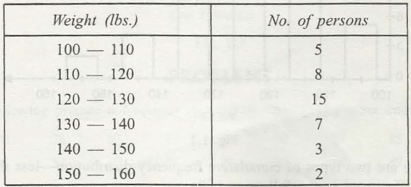
There are mainly four types for frequency distribution. These are –
- Histogram
In this part of graphical representation the upper class and lower class boundaries as well as their heights are proportionate to their related frequencies.
There is an exact formula in which the rfd ot relative frequency density must be on Y-axis and class intervals is there on X – axis. Now, Class intervals can be taken as continuous for the better result. The exact formula is –
Rfd=frequency/ (total frequency * class width)
Rfd is essential to find out in case the class width is not same.
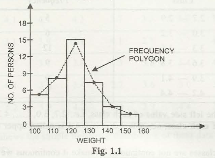
- Frequency Polygon
In the histogram chart, if the joining line of the mid point is a straight line, then it is known as the frequency polygon.
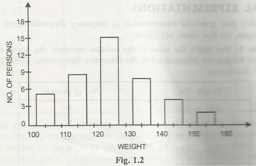
- Bar Charts
The frequency distribution is represented through bars and the center of the cells is considered as the mid points. Simple bar chart represents attributes in a single way.
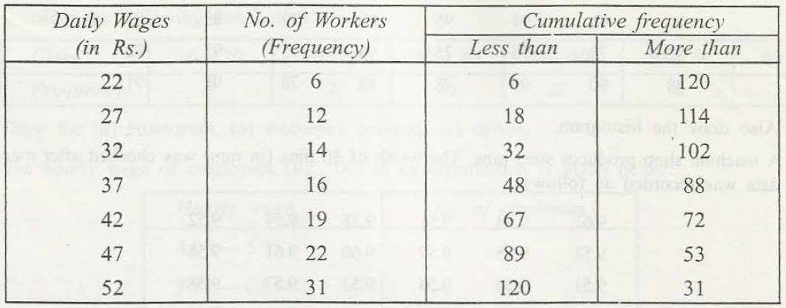
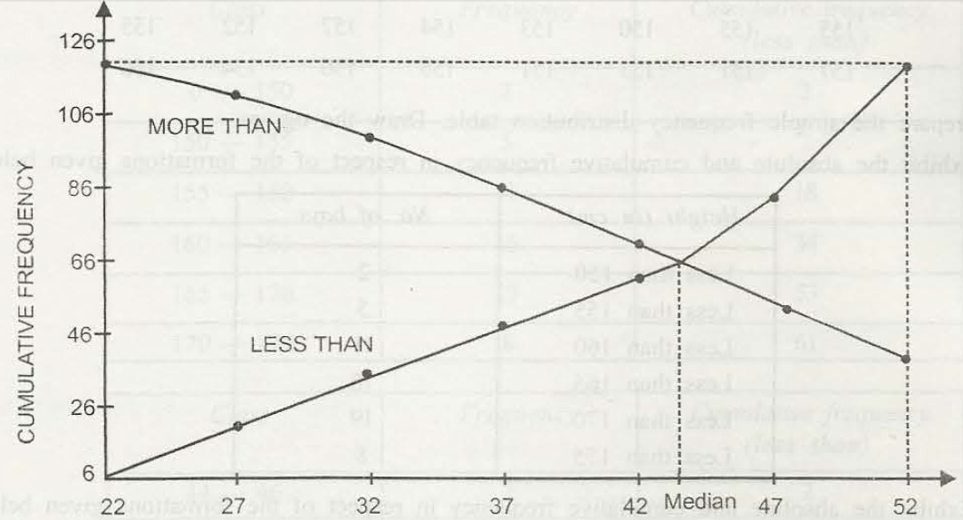
- O Give
If the frequency distribution is more than or less than type, then it is known as cumulative distribution.
Links of Previous Main Topic:-
Links of Next Statistics Topics:-
- Knowledge of central tendency or location
- Definition of dispersion
- Moments
- Bivariate distribution
- Theorem of total probability addition theorem
- Random variable
- Binomial distribution
- What is sampling
- Estimation
- Statistical hypothesis and related terms
- Analysis of variance introduction
- Definition of stochastic process
- Introduction operations research
- Introduction and mathematical formulation in transportation problems
- Introduction and mathematical formulation
- Queuing theory introduction
- Inventory control introduction
- Simulation introduction
- Time calculations in network
- Introduction of game theory
