Opportunities for financial investment are usually categorized into major asset classes. Three of the most significant classes are:
Cash: The term ‘cash’ is rather misleading in since it doesn’t actually represent the physical money bills. Rather, it denotes the short-term debt securities with a low amount of risk and high liquidity. Such generic class also includes investments like CDs (Certificate of Deposits), commercial paper or savings deposits. Cash is also designated for money market. For making things easier, we shall use the name cash.
Bonds: As compared to cash, the maturity of these debt instruments is longer. You already have a decent knowledge of bonds. It would be simplest to consider this asset to be mainly representing Treasury bonds that are long term. This class can also be further broadened for including bonds of different varieties, like a municipal bond, corporate bond, foreign bond, etc.
Stocks: At times, stocks are grouped together, while other times they are categorized further into various asset classes. For US domestic stocks, following sub-classifications are the most common:
- Some stocks that the biggest firms issue trade on a frequent basis and are very much visible. Although not precise, you can consider the 500 biggest firms to constitute the stock market index of S&P 500. This class of assets is known as large-cap stocks, with capitalization being abbreviated as a cap. In this chapter, only these S&P 500 large-cap stocks will be focused on, and well shall simply call them ‘stocks.’
- A few thousands of other stocks are sometimes categorized into ‘small-cap’ or ‘mid-cap.’ As it is inevitable, these stocks have a tendency of trading less frequently, and some are even neglected
There are even sub-classes that are related to stocks, like industry stock portfolio, or stock classification into ‘growth firm,’ ‘value firm,’ etc. Apart from large cap stocks, we shall neglect everything else.
You shouldn’t be taking the categories much literally. They might not be able to represent all the assets that seemingly would fit the classification. For instance, most of the bonds that are of long tenure behave like the asset class of bond in the economy; however certain corporate bonds of long tenure rather behave like stocks. Similarly, it might be possible for a certain firm to own a lot of bonds and its return rates looking like those on bonds rather than looking like those on stocks. Including less or more investments in the three classes of assets would be completely reasonable. (Hopefully, such alterations would change the perceptions we only in a slight manner.) Furthermore, we don’t have much time for considering so many other asset classes. Some of them are like real estate, financial derivatives, hedge funds, art, or foreign investments. Nonetheless, cash, stocks, and bonds serve as three classes of financial assets that are studied the most. So, we shall start examining investments by considering the historical performances of these classes.
7.1A Representation of S&P 500Historical Returns in a Graphical Manner
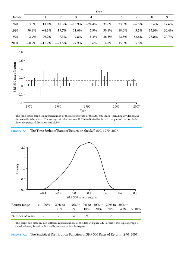
Fig. 7.1 shows the yearly return rates of S&P 500, along with dividends. Both the plot and table provide the same date: In 1970, one would’ve made 3.5% and in 1971, the earning would have been 13.8%, and on and on. Over the 38 years, 11.9% was the average return rate per annum, which is shown on left side through the dot-dashed line and red triangle.
The same data of Fig. 7.1 has been used in Fig. 7.2 and Fig. 7.3, although they have been represented in a different manner. A histogram is represented in Fig. 7.2, based on a few returns falling within a specific range. With this, it is simpler to visualize the spreading out of returns and how usual was it for S&P 500 to perform poorly, really well or about okay. For instance, in table of Fig. 7.1, you see that the return rates were in the range of 10% to 20% for 8 years (2006, 2004, 1988, 1986, 1982, 1979, 1972 and 1971). In the 38 years, the return rates in the range of 0%-10% were most frequent. There were even years when the rates were negative and even a couple of years when the rate was below -20%.
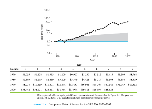
In Fig. 7.3, one more perspective is provided by compound return rate graph. The compounded annual returns have been plotted on logarithmic scale. For instance, an investment in 1970 of 1$ compound return would’ve been $1.20 by the end of 1973.
The annually compounded return rate is also known as geometric average return rate. It holds most relevance to an investor that is long-term and buy-and-hold. The area of the graph shaded by gray is the aspect which marks cumulative inflation of CPI. Purchasing power of $1 in 1970 was equal to $5.57 in 2007. Therefore, the nominal value of $48.628 in 2007 was actually only worth $ 8.73 (48.628/5.57) in 1970.
Any long-term investor would consider arithmetic average return rate, simply known as the average or mean, to be completely misleading. For instance, a -50% return rate would mean that you would lose half and then came 100%, meaning you double, the right geometric return rate you would think of would be zero. Although, the average of the two rates if returns are +25%, there isn’t any way of converting arithmetic return rate to a geometric one. Later, you will come across a real example in which the average return rate was positive even though geometric return rate was a -100%.
The inconsistency between geometric and average return rate can be seen in the data of S&P 500 as well. From 1970 to 2007, the annual return rate was
Arithmetic return rate was 11.9% (higher by 1.1%). Also, taxes haven’t been taken into account in any of these figures.
IMPORTANT: There is no way of inferring average annualized return rate from annual holding return rate, or contrariwise. Only when all return rates are same, meaning no risk is involved, are these two identical. Other than that, the arithmetic return rate is always higher than geometric return rate. (The difference is bigger if risk is more.)
Solve Them!
Question 7.1 What is shown by time-series graph but not in histogram?
Question 7.2 What is that is hard to view in time-series graph but can be viewed in a histogram?
Question 7.3 What is hard to see in a time-series graph but can be seen in a compound return graph?
Question 7.4 What is the average and annual holding return rate for:
- An asset returning 5% every year
- An asset returning 10% and 0% every alternative year.
- An asset returning -10% and 20% ever alternative year.
When more risk is involved, is there a larger distance between two returns?
7.1B Performance for A Few Investments Historically
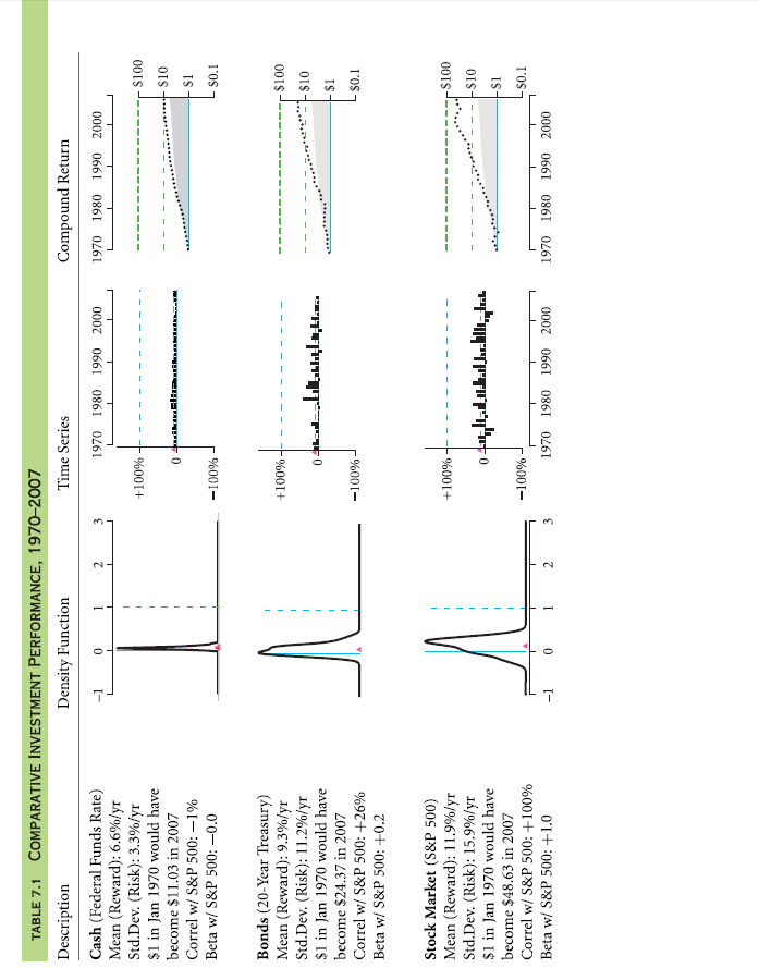
What information does history provide about the patterns of return rate on three primary investment categories, i.e., cash, stocks, and bonds? To find out, you can plot the exact same graph like the ones in Fig. 7.1, Fig. 7.2 and Fig. 7.3. In Table 7.1, they are repeated for a group of investment choices historically, all on a similar scale. You already know about the third row, which shows an investment’s performance in stocks of S&P 500. Only the scale has been changed for making it simpler to compare directly to different investments in below graphs. These small graphs show a lot about the investment’s performance. You shouldn’t be looking to understand it all at just the initial glance. For a proper comprehension, you will have to look through Table 7.7 for some time. There is a distinct story with each element.
Now, let us compare the initial three rows:
Cash is overnight interest rate on Federal Funds in the first row. It is noteworthy that cash returns’ distribution was very tight around its average of 6.6%. In nominal terms, you wouldn’t have ever lost money, although you would also have seldom earned a lot more than the average. The total value of your investment portfolio would have marched steadily upward, albeit very slowly. In January 1970, every dollar invested would have been $11.03 by 2007’s end
Obviously, each dollar’s value would have been eroded by inflation. When it comes to purchasing power, 1970’s $1 was equal to 2007’s $5.57. Thus, the investment of $11.30 would only have been worth nearly $1.98 ($11.30/$5.57) in of 1970 in dollars adjusted for inflation. Your real purchasing power would only have been doubled over 38 years.
Bonds are the 20-year Treasury bond in the second row. In the middle graph, it can be seen that the bars are a bit negative (years in which the return rate was negative.) However, now there are also years in which you would have done a lot better than cash. In comparison to cash, histogram is a lot wider for bonds. Cash was less risky than bonds. The standard deviation indicates that 11.2% of bond risk per year was a lot higher than cash risk of 3.3 %. Thankfully, along with more risk, the average return rate was also higher by 3.3% per annum (9.3% in comparison to 6.6% of cash.) Also, an investment of $1 in 1970 would have become $24.37 of cash in 2007, rather than $11.03.
Stock Market is a portfolio of firms of S&P 500 in the third row. It is indicated by a left graph that there would’ve been even more risk in large stocks than bonds. In comparison to bond histogram, histogram for stock is spread out more. In middle graph, it can be seen that years with negatives of stocks could be a lot worse as compared to that of bonds, although many other years were also truly terrific. Also, there is a reward with the high risk associated with stock. The average 11.9% return rate compensates for the 15.9% risk of S&P 500. An investment of $1 in 1970 could have been $48.63 of worth in 2007.
For a retail investor, the difference between stocks’ $48.63 and bonds’ $24.37 and cash’ $11.03 is trivial. Complete income tax would have been applicable on nominal interest, capital gains tax, which is much lower,would’ve been applicable on capital gain on stocks. With a rough approximation, a retail investor that is highly taxed would’ve ended with nearly $6 worth of cash, $35 worth of stocks and $13 worth of bonds. Thus, between 1970 and 2007, an investor who is taxed highly would’ve been even in cash investment, quintupled in stocks investment and tripled or doubled in bonds investment. For stocks, it was a terrific period of 38 years. Not all the historical periods of 38 years have such a huge difference between bonds and stocks.
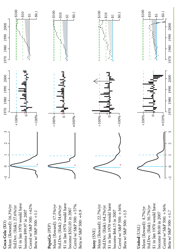
Rather than holding asset classes as a whole, even an individual stock could have been purchased. What would have been the difference between such holdings and investment in stocks? The other four rows display return rates from a few major firms: PepsiCo (PEP), Coca-Cola (KO), United Airlines (UAL) and Sony (SNE). It can be seen that the histograms for these firms are quite wide. An individual stock investment would’ve been very risky, even for household names like these four. In fact, even plotting UAL’s final year is not possible in compound return graph, since the investors of UAL stocks lost all the money invested in bankruptcy of 2003, which would’ve been negative infinity on alogarithmic scale. UAL has illustrated one more issue. Its average return rate was positive even it lost all the money.
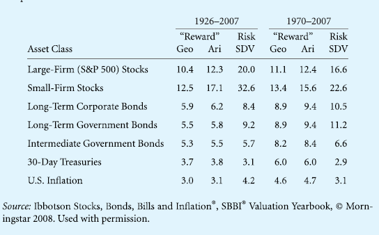
SIDE NOTE: According to a major data provider for finances, following are the returns on major asset classes. The numbers are shown in percentage per year. Arithmetic averages are simply annual means while geometric averages are annualized. The time period of 1970-2007 is alike to that in Table 7.1, thus provides a nice comparison.
Solve Them!
Question 7.5
Classify the following categories of assets according to reward and risk: long term bonds, an individual stock, stock market and cash (money market.)
Question 7.6
Which is riskier or safer: an individual stock or stock market?
Question 7.7
Is there as possibility of you losing all the money even though the average return rate on the investment is positive?
7.1C Market Beta, Correlation and Co-movement
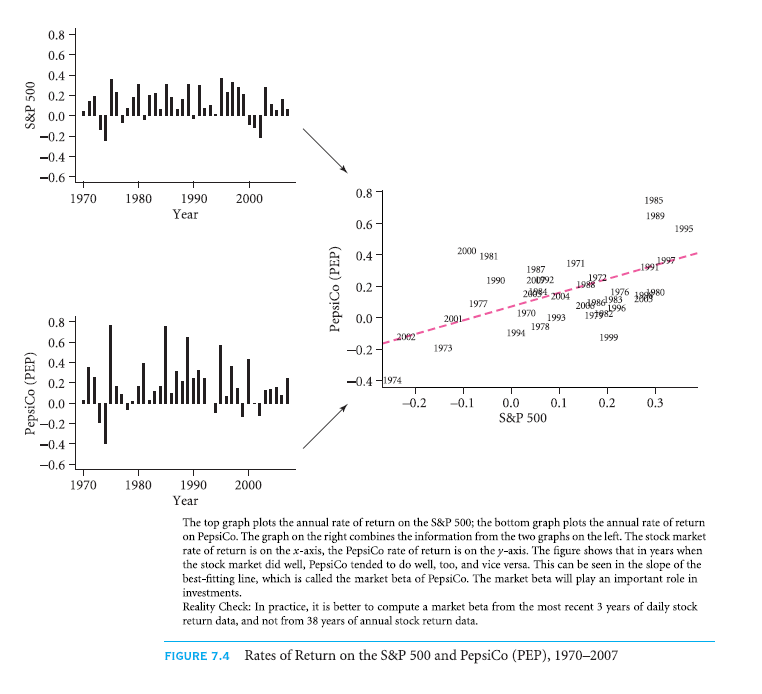
In Fig. 7.4, a particular stock, PepsiCo (PEP) and return rates on S&P 500 have been highlighted. In the column on the left, the graphs of time-series for the two investments have been redrawn from a3rd column in Table 7.1. Is there a noticeable correlation between the two series of return rates? For the years with one being above the mean (or positive), is there a likeliness for the other to be above the mean (or positive), and contrariwise? It definitely seems so. For instance, it is in 1974 when the return rates are the worst for both.
In a similar manner, 2002 and 1973 were poor years for those who invested in either PepsiCo or S&P 500. Contradictory, 1975, 1995, 1989 and 1985 were good for both. There is no perfect correlation. 1999 was a nice year for S&P 500, but bad for PepsiCo; 2000 was a poor year for market in 2000, but good for PepsiCo. It is quite usual for all investments to move in accordance with stock market. Nearly everything has a tendency to be in malaise during the years of malaise. Same is the case with years of exuberance. Such a tendency is known as co-movement.
If one doesn’t like risk, co-movement of investments is very essential. When rest of your portfolio has a decreased value, an investment whose value increases practically serves as an insurance that pays off when needed the most. Even if such an investment has low expected return rate, you might still want to buy it. Contradictorily, it is possible for you not to like an investment that does badly when the rest of the portfolio does badly as well. For including such an investment in the portfolio, it would’ve to offer an expected return rate that is very high.
How to find the extent of co variance of securities with others?As an example, how do PepsiCo and S&P 500 covary? When the market went down, did even PepsiCo go down (thus worsening an already bad situation), or did it actually go up? How such a co-movement be quantified?
This can be answered graphically by plotting two series of return against each, just the way it is done in Fig. 7.4. Then, you need to locate the line that fits the best between two series. This line’s slope is known as a stock’s market beta. It measures the co-movement between return rate on market and return rate on stock. Through it, an investor can get to know how the stock moved along with the market. In financial economics, it has great importance.
- The market beta is more than 1 if the slope of line of best fit is less than 45° diagonal. You could imply from this line that your average stock did much better if stock market did better. As an example, suppose certain stock has a positive slope that is very steep, +3 for instance, the stock would drop by an extra 30% if market drops by an extra 10%. If the portfolio of market were mainly held by you, the bad situation would have been worsened by the stock.
- Your stock didn’t move a lot with stock market if the slope is less than 1 (even if it is plain horizontal line with 0 slopes.)
- The investment comes to the rescue if the slope of the stock is very negative, -2 for example. On an average, when there was a drop of 10% in market, you would have a positive return rate of 20%. Such stocks serve as insurance in market portfolio.
The slope of a particular line of PepsiCo was 0.7. This means that it was bit steep in comparison to the diagonal line. Effectively, it would have meant that PepsiCo would neither have been a great hazard nor a good insurance for you if you had held the stock market. You would’ve earned 0.9% below or above normal in the holdings of PepsiCo if the performance of S&P 500 was 1% below or above normal.
Apart from beta, one more statistic that can be used for measuring co-movement is a correlation. Both beta and correlation are related, but correlation possesses a specific feature not possessed by beta. If the correlation is 100%, it is indicative that the two variables move perfectly together, while a 0% correlation is indicative that the two variables move nearly in an independent manner. Two variables move perfectly in opposite direction of correlation is -100%. A correlation cannot ever be out of the range of +100% to -100%.
In the case, if PepsiCo, you can figure it out that it has a correlation of +58%. The limited range of correlation is a disadvantage and an advantage at the same time. It is advantageous considering that correlation can usually be judged easier than beta. Coming to the disadvantage, concept of scale doesn’t exist with correlation. Even if y variable changes very slightly with x, correlation can be 100% (for example, if every y=0.001. x.) On the other hand, beta may be anything between plus infinity and minus infinity.
You can always imply a positive beta with a positive correlation, and contrariwise. Obviously, correlation and beta only measure the average co-movement. There can be years during which stock market and investment don’t move together even if the investment has a positive beta. (Year 1999 and 2000 for S&P 500, and PepsiCo.) On average stocks having negative betas are rare, for which there is a positive return rate on stock even with negative market return. There are just a few categories of investment that are considered to be correlated negatively with market, mainly gold along with other different precious metals.
Solve Them!
Question 7.8 How can market beta be graphed? What must be plotted on the y-axis and x-axis respectively? What do you mean by an individual data point?
Question 7.9 What does a market beta of a market mean?
7.1D the Take a ways from the Big Scenario
From graphs like these, you can indeed learn everything that is possible about investment. These facts will be explained in details soon. Meanwhile, the following are some vital points shown by the graphs:
- It is historically true that the average return rates offered by stocks are higher than that of bonds. In turn, the average return rates of bonds are higher than that of cash. Although, you must remember that it was only the case on average. There might’ve been a reverse relationship in any particular year. For instance, in 2002, cash investors earned nearly 1.7% while stock investors lost 22%.
- Even though on average stocks performed well, you might have lost everything with your investment, particularly if you’d invested in an individual stock. As an example, in 1970, if you would have invested in United Airlines, all your investment would’ve been lost.
- Cash served as the safest form of investment. The distribution of cash is centered tightly around its average. Thus, none of the years had negative returns. In comparison, bonds were riskier and stock even more so. (Stocks are considered to be noisy at times since it’s very hard to predict their performance.)
- Seemingly, reward and risk are related. The average return rates had a tendency of being higher, if the investments were riskier. (However, you shouldn’t over read the uncomplicated relationship between standard deviation and mean because, in next chapters, you will learn that you have to look at risk in context.)
- In comparison to individual stocks, there was less risk associated with large portfolios that consisted several stocks. The 16% risk of the stocks of S&P 500 was a lot less than that of most of the individual stocks (for example, the 25% risk of PepsiCo.) This is because of the diversification phenomenon.
- The compound (geometric) return rate is always smaller than average return rate. Usually, although not always, an average returns rate that is positive translates into compound holding return rate that is positive. For instance, United Airlines lost all the money of its investors but still had positive average return rate.
- Stocks have a tendency of moving together. As an example, considering 2002 and 2001, S&P 500 went down, and along with it, all individual stocks went down as well. In contrast to that, most stocks had a tendency of going up in 1998. All stocks did well in mid-1990s. On the other hand, returns on money market didn’t have much relevance with stock market. As far as long-term bonds are concerned, they were somewhere in between.
- Correlation between stock market and cash was nearly zero at a yearly frequency, while correlation between stock market and bond returns that were long-term was about 25% and there was nearly 30%-70% correlation between stock market and individual stocks. An important fact of the matter is investment return rates have a tendency of moving together. This fact is market beta’s foundation. In Chapter 8, this measure of risk called market beta shall be explained further.
7.1E Will History Be Repeated?
A financier wouldn’t be concerned about history just for the sake of it. Rather, they would actually be more interested regarding the future. The usefulness of history lies only in the fact that it is best indicator for the future that you have at your disposal. How much time would you consider as history? A year? Maybe thirty years? Or perhaps even a decade? What can be told certainly is that if instead of 1970, had you drawn gaps starting in 1926, the major conclusions would’ve been nearly the same? On the other, it wouldn’t have been so if you began in 2001. What you would have seen is two extremely poor years for investors in stock. Intuition tells you that this sample time period would not have been represented at all. If you wish to make sense enough inferences about the happenings of financial market, you require several years of history, simply a year or two won’t be enough, and definitely not the investment performance of six weeks sold by certain friends or funds. On the other hand, there is no way of reliably saying what will be your return rate over the next year. Forecasting the average yearly return rate over five to ten years is easier than doing it over a year. The outcome of your investment over an individual year is bound to be extremely noisy.
Depending on statistics that are computed over several years is a way better option than depending on just a single year. Around 20-30 years is required as minimum for knowing something about the patterns of return. Still, it might not be sufficient for making you feel confident. Once again, what you are actually interested in is what is going to happen over the course of next few years, what has already happened over the past years doesn’t concern you. Of course, historical performances are helpful for judging, but you should never blindly trust it. For example, in 2001, a UAL investor might have anticipated a positive average return rate but would have ended up extremely disappointed. In 1986, Japanese stock market’s investors saw the stock market index of Nikkei-225 rose to 40,000 from 10,000 by the year 1990, which means a return rate of 40% per annum. If history were considered to be a reliable guide, the investors would’ve expected 3.2 billion (40,000 x 1.4013)by 2002. Contradictorily, in April 2003, Nikkei fell below 8,000. It has recovered only recently to 15,307 by the time of December 2007. In such a case, history would have served as an awful guide.
Regardless of the disadvantages associated with the use of historical information for forecasting future returns, it is a good advantage to have historical data. It serves as a great source for forecasting power; thus, you need to use historical statistics just like everyone else. You should be aware enough to not depend on them too much. While looking at an investment with very low or very high return rates in past, you mightn’t want to trust that the scenario will remain the same in future.
Relatively, what information about history are more trustworthy and what is less trustworthy?
Historical Risk: Correlation and standard deviation (how there is tendency of stock movements being related or unrelated) are usually stable, particularly for diversified portfolios and large classes of asset. Thus, for 2008-2010, a risk for 25% can be expected with PepsiCo per year with nearly 1 market beta and 60% of correlation.
Historical Mean Reward: The past average return rates are not that reliable when it comes to predicting the expected return rates in future. Therefore, you can’t actually believe the 18% return rate of PepsiCo shall continue in the future.
Realizations: It is certainly not worth believing that previous realizations serve as a trustable forecaster of realizations in future. PepsiCo is not likely to have 24% return rate in 2008 simply because it had the same return rate in 2007.
An analogy from lottery would be helpful in explaining the last couple of points in a better manner. Your past results in the lottery are not likely to predict your results in future, particularly if you had a big win once in the past. Perhaps, if there were a million historical realizations, you could have trusted it. But you actually don’t have so many.
Hence, your previous payoff is not that good a forecaster of your payoff for the next week. Furthermore, you should certainly not consider the recent realizations to indicate your future. A certain number might win you the lottery one week, but it doesn’t mean that the same number would win you again in next week.
From here on, we shall simply presume that we have knowledge of the statistical distributions from which returns for future investments shall be drawn. It becomes much easier this way for an illustrative purpose. In real world, for using our techniques, you will generally gather historical data and consider distribution in future to be same as distribution historically. (Some real-world investors make use of other techniques that are more sophisticated, but eventually such techniques are nothing but a variation of this technique. Although you shouldn’t ever trust in a blind manner, historical data are just a guide to future that is merely imperfect.
Links of Previous Main Topic:-
- Risk and return risk aversion in a perfect market
- Introduction of corporate finance
- The time value of money and net present value
- Stock and bond valuation annuities and perpetuities
- A first encounter with capital budgeting rules
- Working with time varying rates of return
- Uncertainty default and risk
Links of Next Financial Accounting Topics:-
- Cash bonds and stocks 1970 to 2007
- Market institutions related to equity an overview
- Anecdote
- Problems
- Summary
- For value financial structure and corporate strategy analysis
- Capital structure dynamics firm scale
- Capital structure patterns in the united states
- Investment banking and mergers and acquisitions
- Corporate governance
- International finance
- Options and risk management

